← HOMEPAGE

PLAYMATE

YEAR
2026
PLATFORM
iOS 
PRODUCT
Sports matchmaking app
MY ROLE
UI/UX Designer
TOOLS USED
ClaudeStitchFigmaMiro
◆ PROJECT OVERVIEW

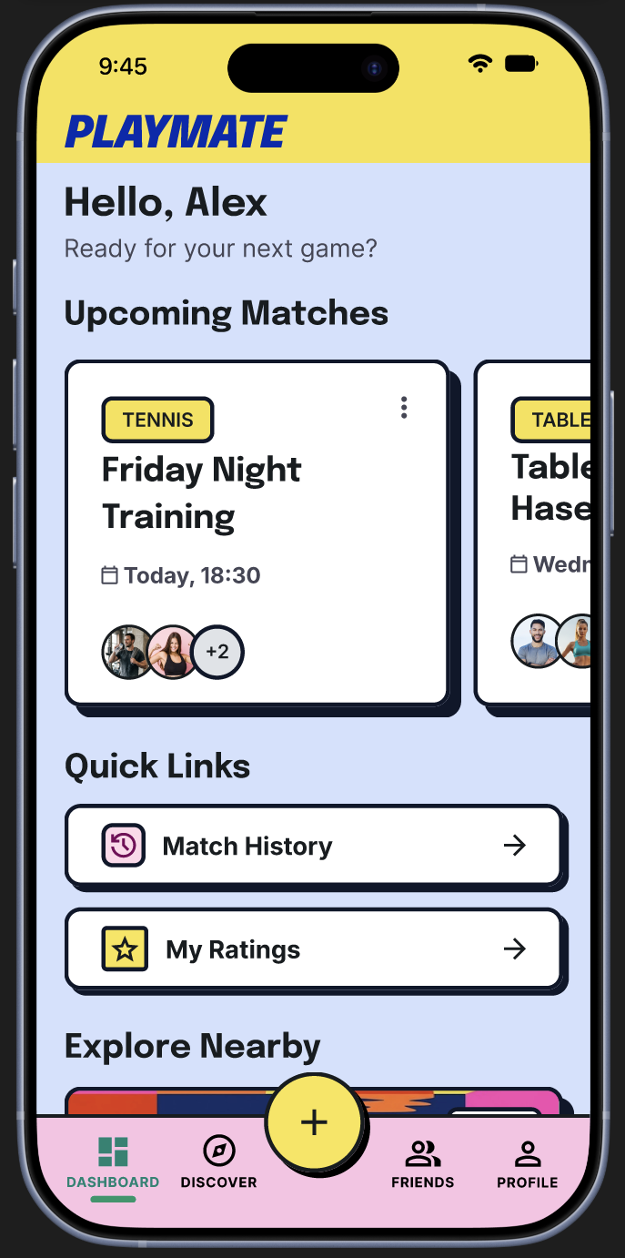
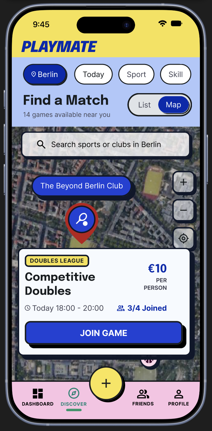
PlayMate is a community-driven mobile app that connects people through sport. Pick a sport, set a skill level, and find a game nearby or create one. Profiles carry reliability scores and peer reviews, and game rooms handle scheduling, cost-splitting, and waitlists automatically.

◆ HYPOTHESIS

The main barrier to playing sports consistently isn't motivation; it's the friction of finding the right person and trusting them enough to show up.

User interviews confirmed this: everyone already had a sports routine, but all struggled with coordination, skill matching, or trust when it came to playing with someone new.

◆ THE PROBLEM

The tools people use to organize sports; WhatsApp threads, Facebook groups weren't built for it. People want to exercise consistently and build social connection through sport, but the process breaks down at every step: finding a partner, coordinating time and place, and trusting a stranger enough to show up.

◆ THE SOLUTION

Scattered group chats turned into structured game rooms where profiles double as reputations, logistics run themselves, and a no-show penalty keeps everyone accountable.

Sneak peek from the prototype
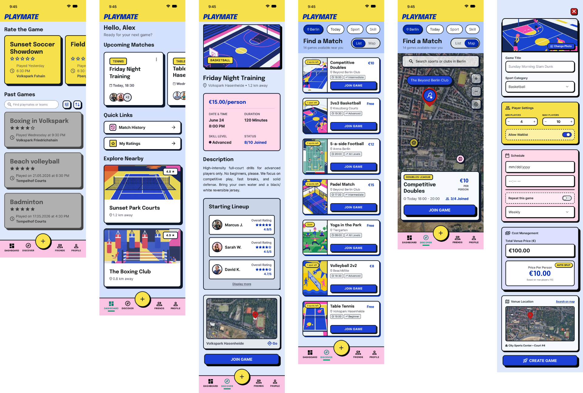
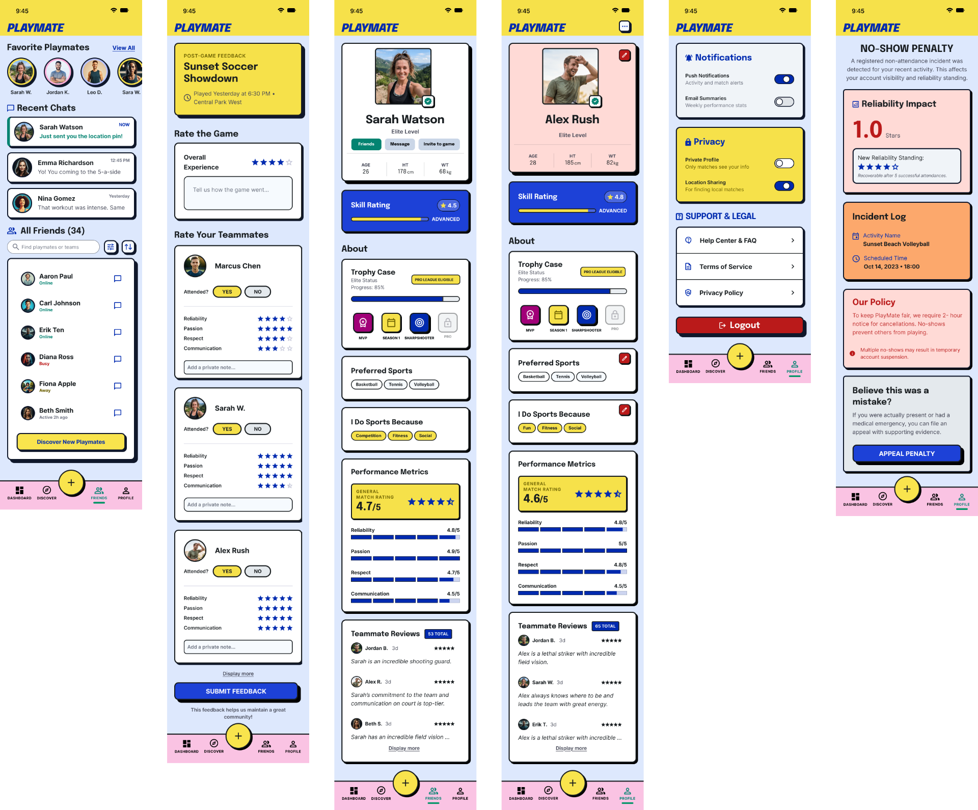
◆ PROTOTYPE PREVIEW
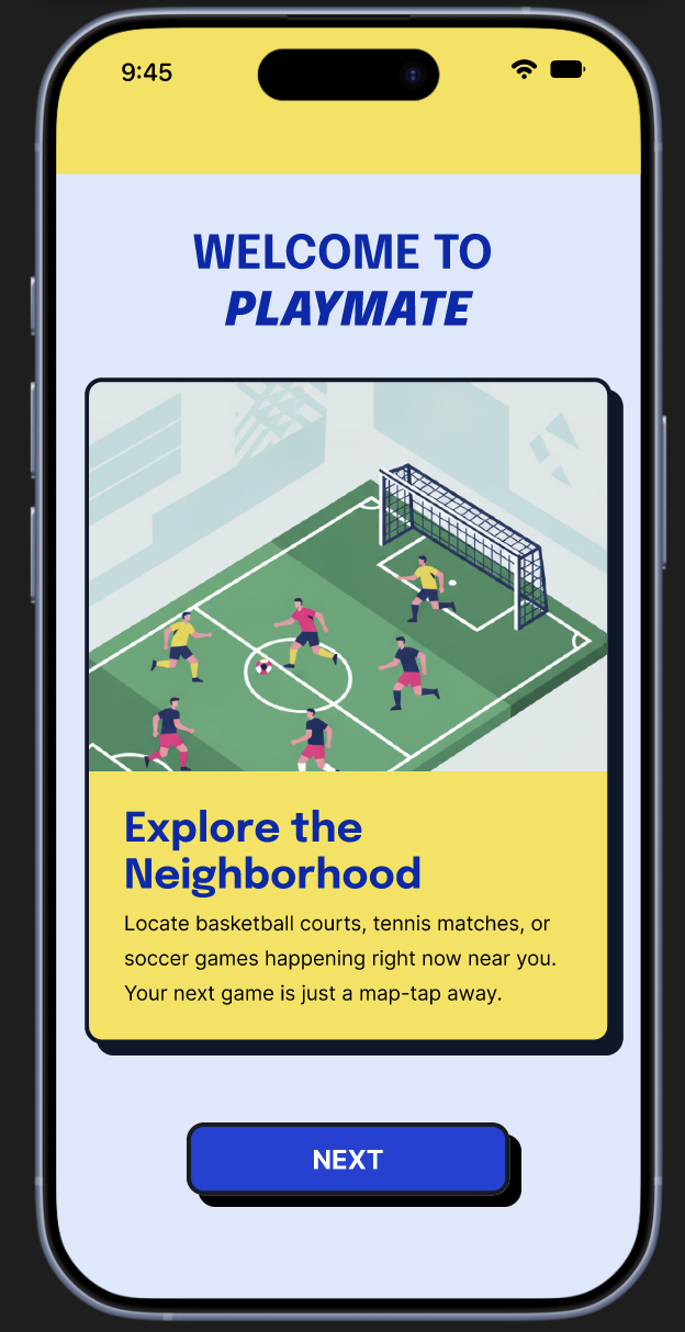
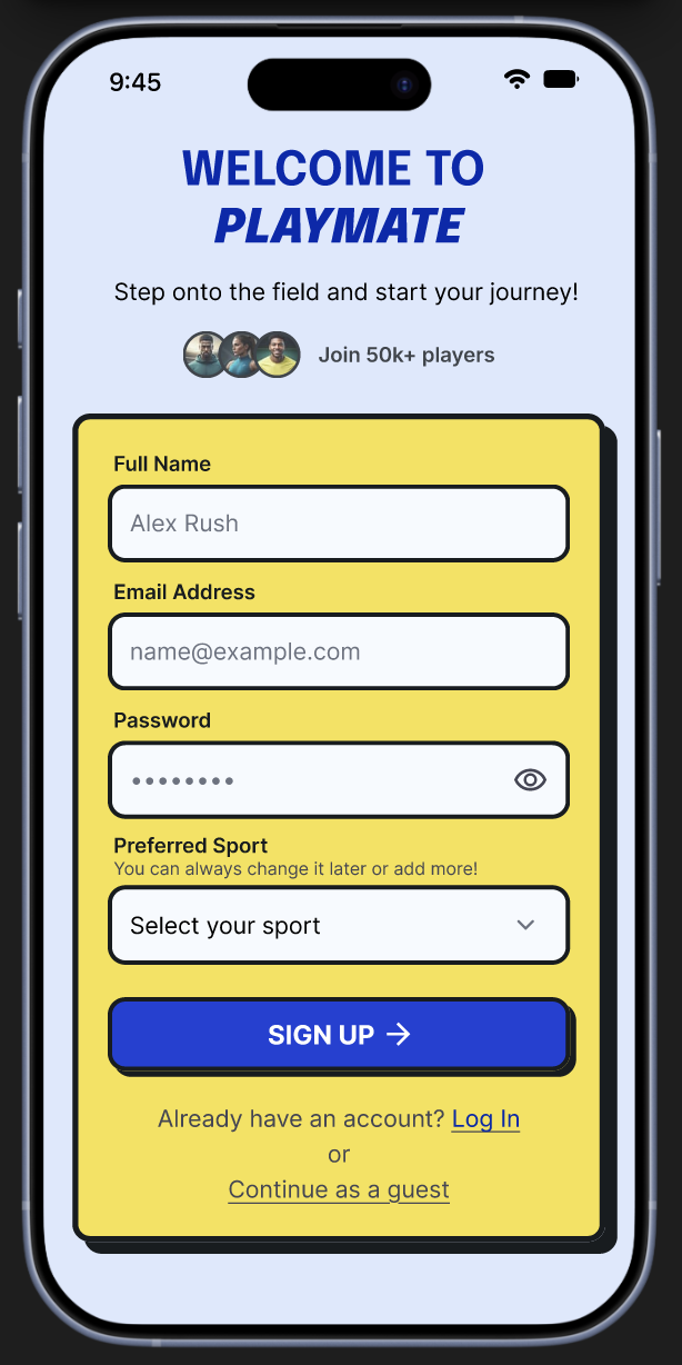
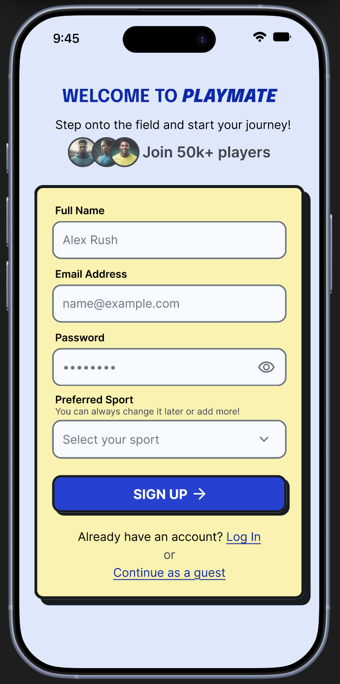
PlayMate onboardingPlayMate dashboard
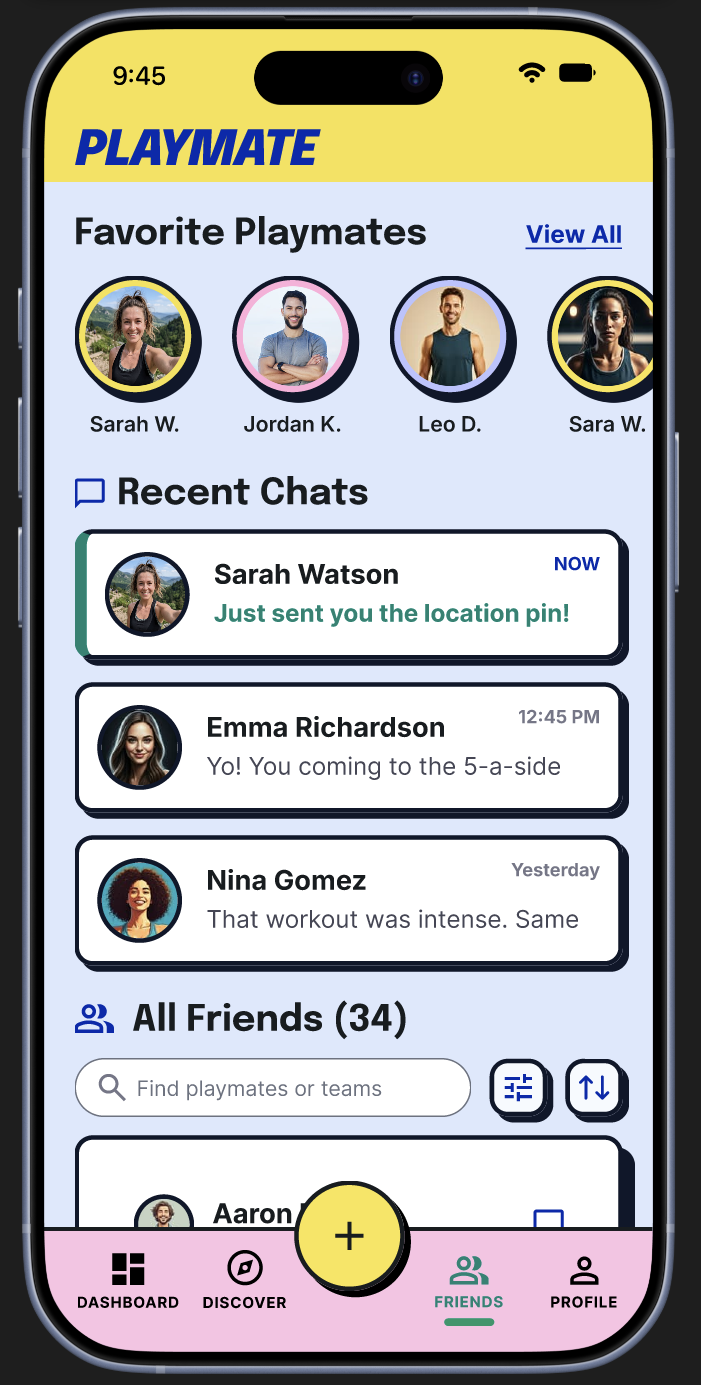
PlayMate discoverPlayMate friends
"The organiser always ends up spending a lot of hours managing polls, chasing confirmations, handling last-minute cancellations. It kills the fun."
— BAJO · INTERVIEW PARTICIPANT

With the hypothesis and problem framed, user research validated the friction points and shaped the two archetypes the product is built around.

◆ USER RESEARCH

Two user archetypes, one shared friction.

4 semi-structured interviews with active sport players in Berlin and Istanbul surfaced two recurring archetypes. Both had an existing exercise habit; neither had a platform built for how they actually organize games.

◆ PRIMARY PERSONA

Summer: The Social-Performer

Combines the traits of interviewees who prioritize community and finding a "tribe," using sport to combat social isolation. The app is designed primarily around her needs; she represents the segment with the biggest opportunity.

◆ SECONDARY PERSONA

Daisy: The Efficiency-Reliability Seeker

Combines the traits of interviewees who get frustrated by logistics, cancellations, and skill gaps. The app is built to work for her too, without her edge cases overriding the primary user's needs.

◆ KEY INSIGHT
Newcomers are more likely to exercise regularly if they feel a social commitment to a group; but they hesitate to join local sports because of a lack of trust. A map-based "game room" system reduces organizational friction more effectively than a group chat ever could.
◆ HOW IT WORKS

Three steps, from cold start to trusted regular.

01

Set up your profile.

Pick your sports, set a skill level, and tell the community how you play. Your profile is your reputation. Reliability score and peer reviews build over time.

02

Find or create a game.

Browse open game rooms nearby by sport, skill level, time, and cost. Join in one tap, or create your own session and let others find you. Scheduling, cost-splitting, and waitlists are handled automatically.

03

Play, rate, repeat.

After the game, rate your teammates across reliability, passion, respect, and communication. The better you show up, the easier it is to get into future games.

◆ DESIGN DECISIONS

Vibrant neo-brutalist.

◆ VISUAL STYLE

A high-contrast palette with thick black strokes and raw, zero-blur drop shadows for a retro pop-art aesthetic.

◆ UX STRATEGY

Gamified interactions and playful isometric illustrations, built for an energetic, community-driven atmosphere.

◆ INFORMATION ARCHITECTURE

A modular, cards-based layout for high scannability and clear visual hierarchy.

◆ COLOR CHART
Light blue
#AEC8FB
35%
Yellow
#FFE145
30%
White
#FFFFFF
15%
Blue
#3D57F5
11%
Pink
#F5A0C0
6%
Dark navy
#1A1A3A
3%
Background
Screen & container backgrounds
Primary / CTA
Buttons, highlights, accents
Surface
Cards, input fields, overlays
Secondary
Nav, interactive elements
Accent
Badges, tags, alerts
Text / UI
Body text, icons, borders
◆ TYPOGRAPHY
EPILOGUE — TITLES & HEADINGS
Aa
ABCDEFGHIJKLMNOPQRSTUVWXYZ
abcdefghijklmnopqrstuvwxyz · 0123456789
App name · Screen headings · Section titles
Weights: 700 · 800 · 900
INTER — BODY & UI ELEMENTS
Aa
ABCDEFGHIJKLMNOPQRSTUVWXYZ
abcdefghijklmnopqrstuvwxyz · 0123456789
Body text · Buttons · Labels · Captions
Weights: 400 · 500 · 600 · 700
App name / Logo
800 · 13px · uppercase · tracking+
Epilogue
PLAYMATEPlaymate logoPlaymate icon in iOS dock
Screen heading
800 · 26px · line-height 1.15
Epilogue
Welcome back, Alex!
Section title
700 · 17px
Epilogue
Upcoming Matches
Card title
600 · 14px
Inter
Friday Night Training
Body text
400 · 13px · line-height 1.5
Inter
Sunset Park Courts · Sat 7pm · 6 players joined
Button
600 · 13px · pill shape
Inter
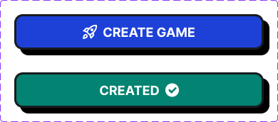
Playmate button styles
Label / Badge
700 · 10px · uppercase
Inter
SOCCER · OPEN · FREE
Caption / Meta
400 · 11px · muted
Inter
4.1 km away · 2 hours ago · Reliability 4.6★
◆ USABILITY TESTING

Four rounds, one prototype.

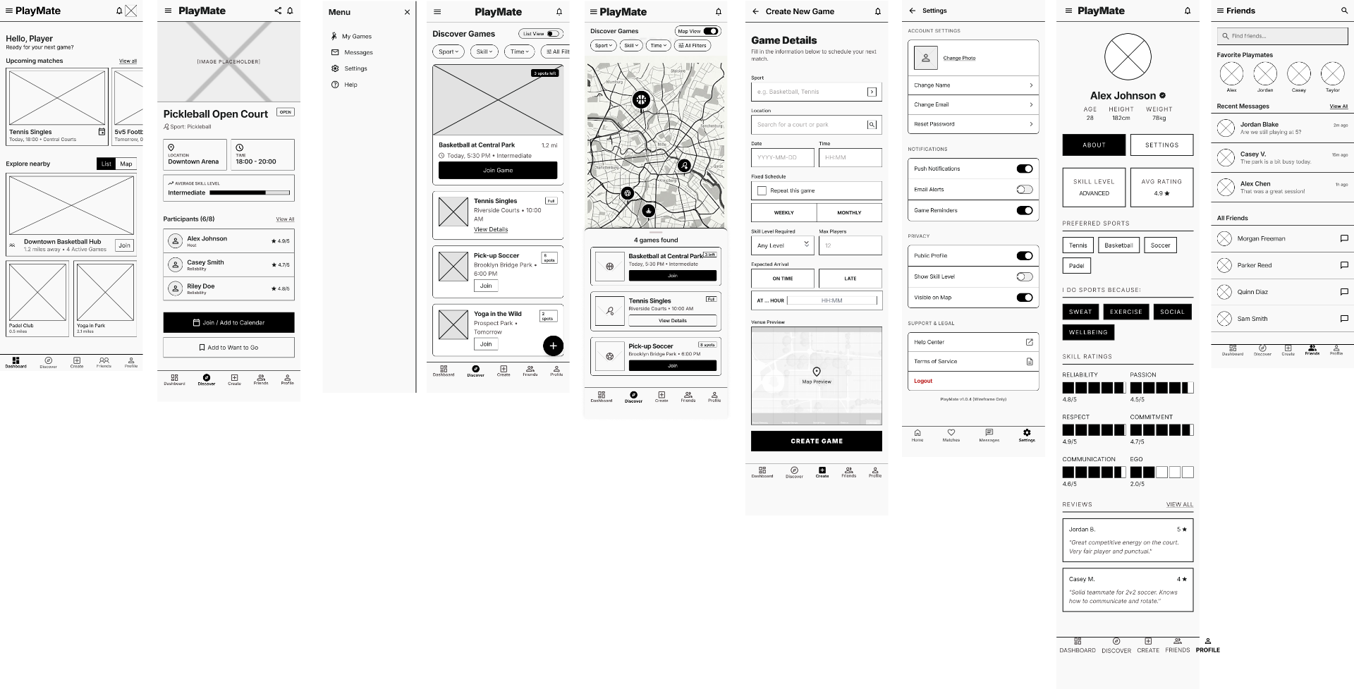
PlayMate went through four rounds of moderated usability testing: One on the low-fidelity wireframes, three across successive high-fidelity builds. Each run with 20 participants completing core tasks: Create a game, join a game, rate a teammate after a match, and review a profile. Findings were clustered after every round and fed directly into the next iteration.
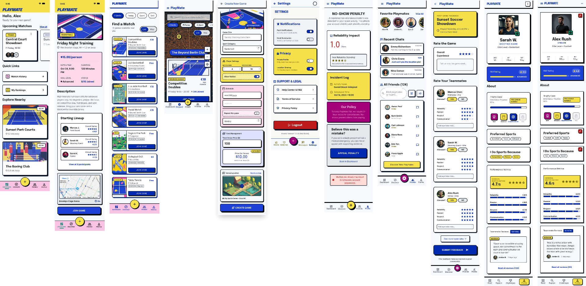
◆ ROUND 1 · LOW-FIDELITY WIREFRAMES · n=20
Low-fidelity wireframes for PlayMate screens
Didn't know when or how to rate teammates  after a game
16/20 · 80%
Rating screen now opens automatically once a game ends
Cost-splitting was unclear before joining a  paid game
14/20 · 70%
Cost splits automatically and shows upfront; cash or PayPal
Missed the 'Create' action in the nav bar
12/20 · 60%
Centre Create button enlarged and elevated above the bar
Unclear whether a game needed a minimum headcount to happen
11/20 · 55%
Game creators can now set a min/max player count
Expected some consequence for a no-show
10/20 · 50%
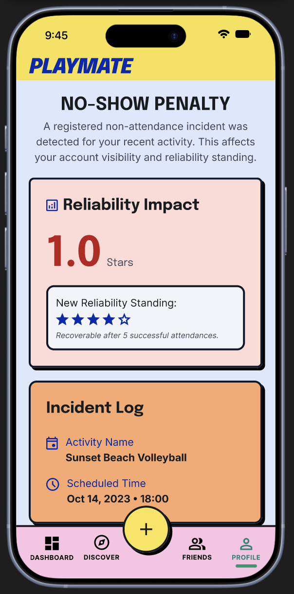
Automatic 1-star reliability penalty added, shown on profile
Wanted to book the venue directly, not just see  its name
9/20 · 45%
Venue tap now links out to the venue's own booking app
Asked for a back-up plan for last-minute cancellations
8/20 · 40%
Waitlist added; extra players sit on the waitlist and auto-fill last-minute cancellations
KEY INSIGHT · 80% of participants had no clear moment to rate a teammate — the loudest signal of round one, and the reason the rating screen now fires automatically at game-end instead of waiting to be found.
◆ ROUND 2 · HIGH-FIDELITY WIREFRAMES, v1 · n=20
High-fidelity wireframes v1 for PlayMate screens
Landed on Home with no first-time context
15/20 · 75%
Onboarding flow designed and added
Cards blended into the background
13/20 · 65%
Contrast between cards and background increased
Map scrolled away with the list, lost their bearings
12/20 · 60%
Map now stays fixed while the list beneath it scrolls
Couldn't find where a no-show would show up
11/20 · 55%
Clear entry point added; incident log recoloured yellow → red
Map pins were hard to read at a glance
10/20 · 50%
Pin design redrawn for readability
Wanted an in-line action menu on tapping another user
9/20 · 45%
Tapping a user now surfaces add friend / message / invite to game
Inconsistent button sizes across screens
9/20 · 45%
Button heights standardised app-wide
Called out the palette (hot pink) as visual noise
8/20 · 40%
Palette reduced for consistency
Corner radius read as dated, off-brand
7/20 · 35%
Rounded corners added across components
Expected Settings inside Profile, not its own tab
6/20 · 30%
Settings moved into a profile overlay
Confused by 'Shooter'-style position tags
5/20 · 25%
Position tags removed from user cards
KEY INSIGHT · 75% of participants dropped straight into Home with zero context. Clear evidence a first-time flow wasn't optional, and the top priority heading into round three.
◆ ROUND 3 · HIGH-FIDELITY WIREFRAMES, v2 · n=20
PlayMate round 3 screen 1PlayMate round 3 screen 2
PlayMate round 3 screen 3PlayMate round 3 screen 4
Background brightness caused visible eye strain
12/20 · 60%
Background colour toned down across all screens
Couldn't tell past games apart from active, editable ones
10/20 · 50%
Past game cards restyled in greyscale
Asked to try the app before signing up
9/20 · 45%
'Continue as guest' option added to onboarding
Found Create Game jarring as a full-page jump
8/20 · 40%
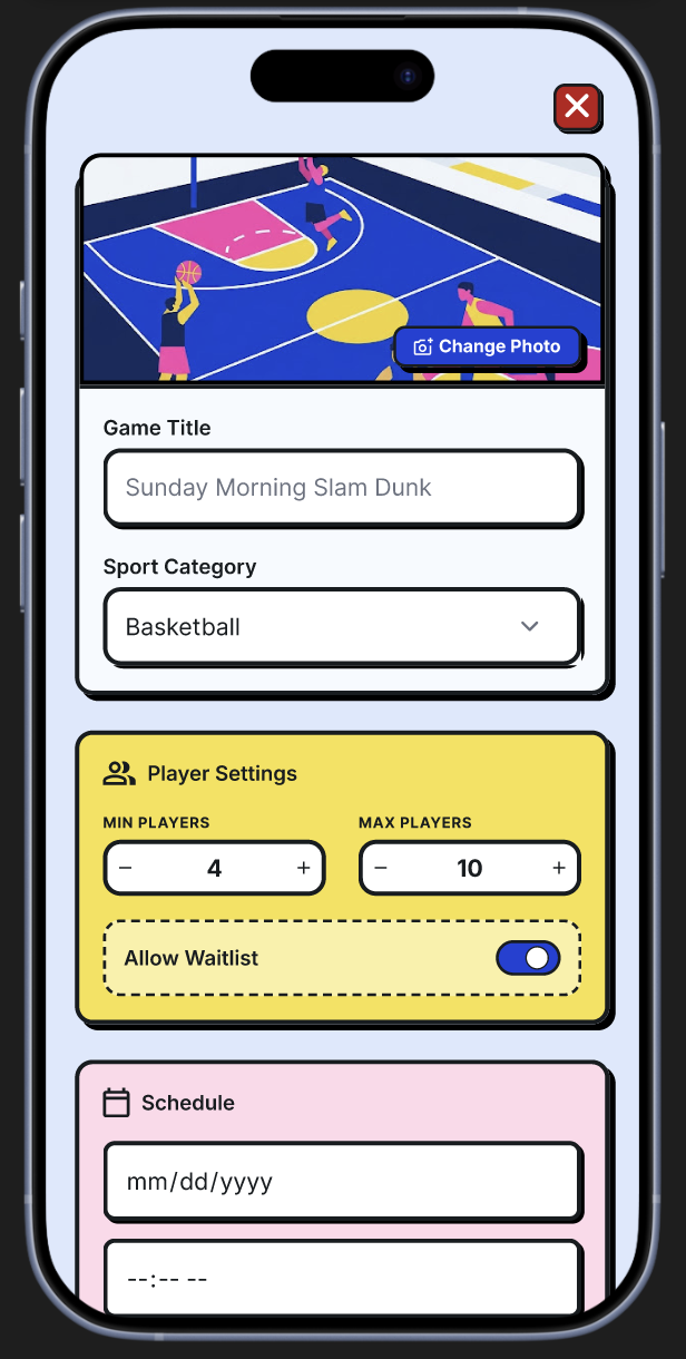
Create Game now opens as an overlay, not a new screen
Tried to go back to a previous onboarding screen but couldn't
8/20 · 40%
Circular pagination added so users can move freely between onboarding steps
Called the 'Welcome' text repetitive and oversized across screens
7/20 · 35%
Welcome text scaled down and made less visually dominant
Missed the social-proof number on the signup screen
7/20 · 35%
Social-proof number enlarged for clearer visibility
Scanned the onboarding copy without actually reading it
6/20 · 30%
Onboarding copy shortened into brief, slogan-style lines that catch the eye
Found the bright yellow tiring over a longer onboarding session
6/20 · 30%
Ran a colour-accessibility test and softened the yellow to a paler, calmer tone
Assumed an empty input field was already active
5/20 · 25%
Input stroke changed from black to a very light grey to signal inactive state
Visually grouped 'Past Games' with the wrong card above it
5/20 · 25%
Re-checked proximity and corrected the spacing so Past Games groups with the right section
KEY INSIGHT · 45% asked to try the app before signing up. The strongest signal that onboarding friction was blocking discovery, and the reason a 'Continue as guest' option was added to onboarding.
◆ FINAL · ROUND 4 · HIGH-FIDELITY WIREFRAMES, v3 · n=20

The final round paired task-based testing with a structured heuristic pass across four themes.
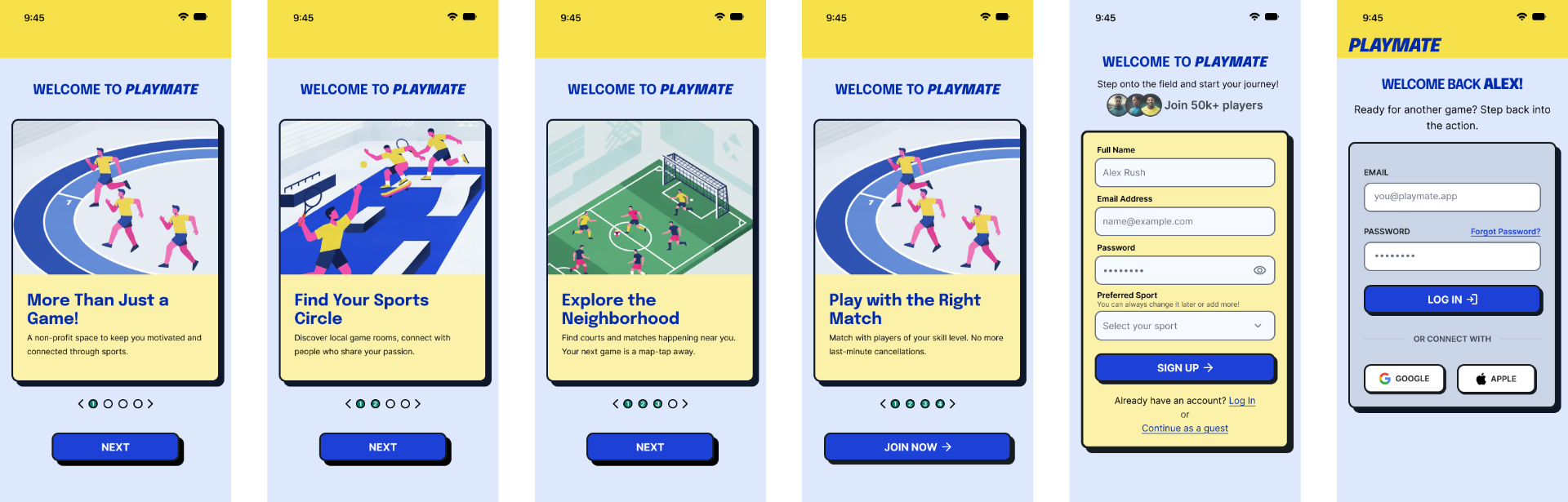
Round 4 high-fidelity wireframes 1
Round 4 high-fidelity wireframes 2
Round 4 high-fidelity wireframes 3
◆ WHAT I'D DO DIFFERENTLY

Given more time, I'd push these three findings further.

The test rounds fixed the highest-impact blockers, but a few smaller signals kept recurring. Rather than shipping quick patches, I'd treat each as its own design sprint: validate the root cause, prototype alternatives, and measure whether the fix actually changes behaviour.

Said they'd lose track of Past Games once the unrated list grew10/20 · 50%

I'd explore filtering and sorting controls for the unrated list; collapsible sections, 'rate later' swipes, or a completion badge, and track task success as the list grows.

Called the scroll cue 'webby,' not mobile-native7/20 · 35%

I'd replace the custom scroll indicator with platform-native patterns; peeking cards, pagination dots, or spring physics, and validate it feels native on iOS.

Questioned why the app name/logo took up space on Home6/20 · 30%

I'd test a collapsed header treatment: hide the logo on scroll, move it inside the profile area, or replace it with a contextual page title and measure screen real-estate satisfaction.

◆ ECOSYSTEM MAP

Information architecture.

◆ 01 · PRE-LOGIN GATEWAY

Value before sign-up.

Onboarding walks new visitors through the app's value before asking for anything.

  • More Than Just a Game
  • Find Your Sports Circle
  • Explore the Neighborhood
  • Play with the Right Match
  • Sign up, log in, or continue as a guest
◆ 02 · POST-LOGIN MEMBER SYSTEM

A personalized workspace.

Once authenticated, the app splits into five routes.

  • Home — dashboard with upcoming matches and unrated past games
  • Discover — map-based game search with filters
  • Create Game — launched as an overlay
  • Friends — recent chats, friend list, feedback on teammates
  • Profile — trophy case, ratings, match history, no-show log
◆ CONCLUSION

Organising sport shouldn't feel like a second job.

PlayMate started with a simple observation: the tools people use to organise sports weren't designed for it. Through research-led design, iterative wireframing, and four rounds of usability testing, it became a structured answer to three human problems — finding the right partner, coordinating logistics without chaos, and building trust with a stranger before the game.

The result is a product concept that makes playing feel like playing again.

NEXT CASE / 02
HealthBar
OPEN →