HEALTHBAR
HealthBar turns Apple Health data into an RPG-style companion. Steps, sleep, water, mood, and recovery become HP, buffs, debuffs, and tiny quests; narrated by a gentle mentor character, Master Ronnie, and kept visible across iPhone, Apple Watch, and Home Screen widgets.
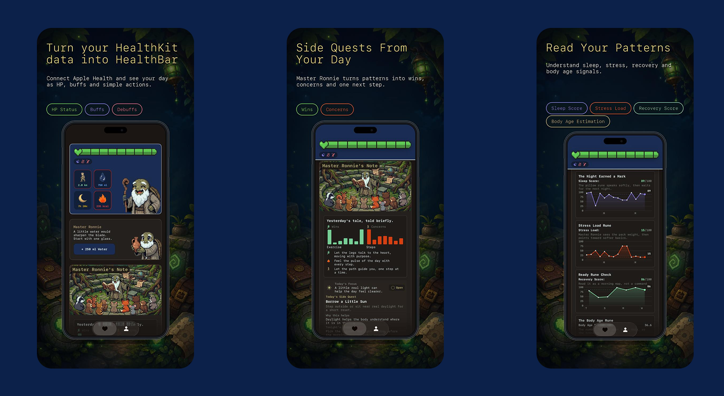
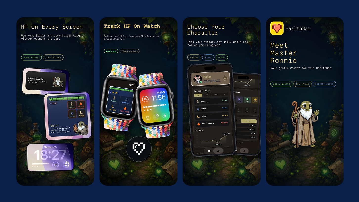
Users will check in on their health more often and act on it; if the data is framed as a story with a mentor, not a spreadsheet with a verdict.
Most health apps present raw numbers and guilt-driven push notifications. Rings, graphs, streak counters; none of it tells you what to do next, and the tone often reads like a scolding rather than a suggestion.
One HP score that compresses the whole day into a single number, a mentor who offers one small action at a time, and a combat log that narrates the day instead of grading it.
Validating dashboard comprehension.
The first version of the HP dashboard tested poorly: the accent colors sat too close in value against the dark background, body copy competed with headers at nearly the same size, and there was no clear read-order between "the one number that matters" (HP) and everything else around it. I ran a moderated comparison between the original dashboard and a redesign built around a stronger color and type hierarchy.
Prototype test · n=9 · Dashboard comprehension task (v1 vs. redesign)
Once HP moved to a single dominant color against a quieter background, and body copy dropped a full size below headers, comprehension roughly doubled and RPG-term confusion dropped by two thirds. The fix wasn't more explanation, it was letting one thing lead.
Having fixed the reading problem, the next step was understanding why people abandon health apps in the first place.
A quantitative + qualitative survey.
18 people who currently use or have used a health/fitness tracking app, ages 21–45, were surveyed on what makes them stay, mute notifications, or delete the app entirely.
Have muted or disabled notifications from a health app because they felt guilt-inducing or repetitive.
Find charts and trend graphs hard to act on without context: "I see the line drop, I don't know why."
Say they'd check a health app more often if it felt encouraging rather than evaluative.
Want one clear suggestion per day rather than a full dashboard of metrics.
Said a Home Screen widget or watch glance matters more to daily habit than opening the full app.
HP status engine.
HealthKit data — steps, distance, active energy, water, sleep, mood, stand time — is compressed into one HP score and a status level, so the whole day is legible at a glance.
A mentor, not a monitor.
Master Ronnie replaces clinical alerts with one small, low-pressure suggestion at a time — "a short walk," "one calm glass" — instead of a red ring demanding to be closed.
Combat log & Ronnie Feed.
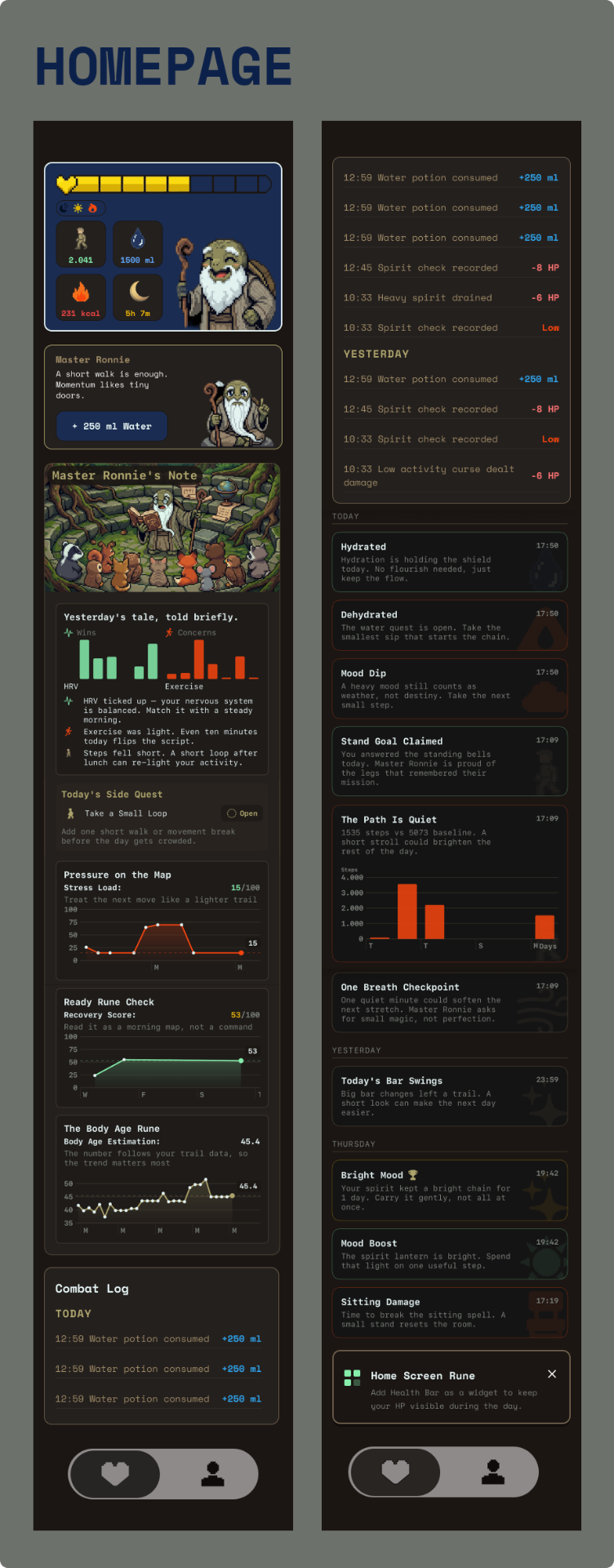
Daily events — a glass of water, a heavy mood, a missed stand goal — are narrated as a game-style log and feed, with trend cards, tiny quests, and achievement callouts.
Everywhere, at a glance.
The same HP snapshot lives on the iPhone dashboard, Home Screen widgets, and Apple Watch, so a user can check status without ever opening the full app.
Information Architecture
Meet Master Ronnie.
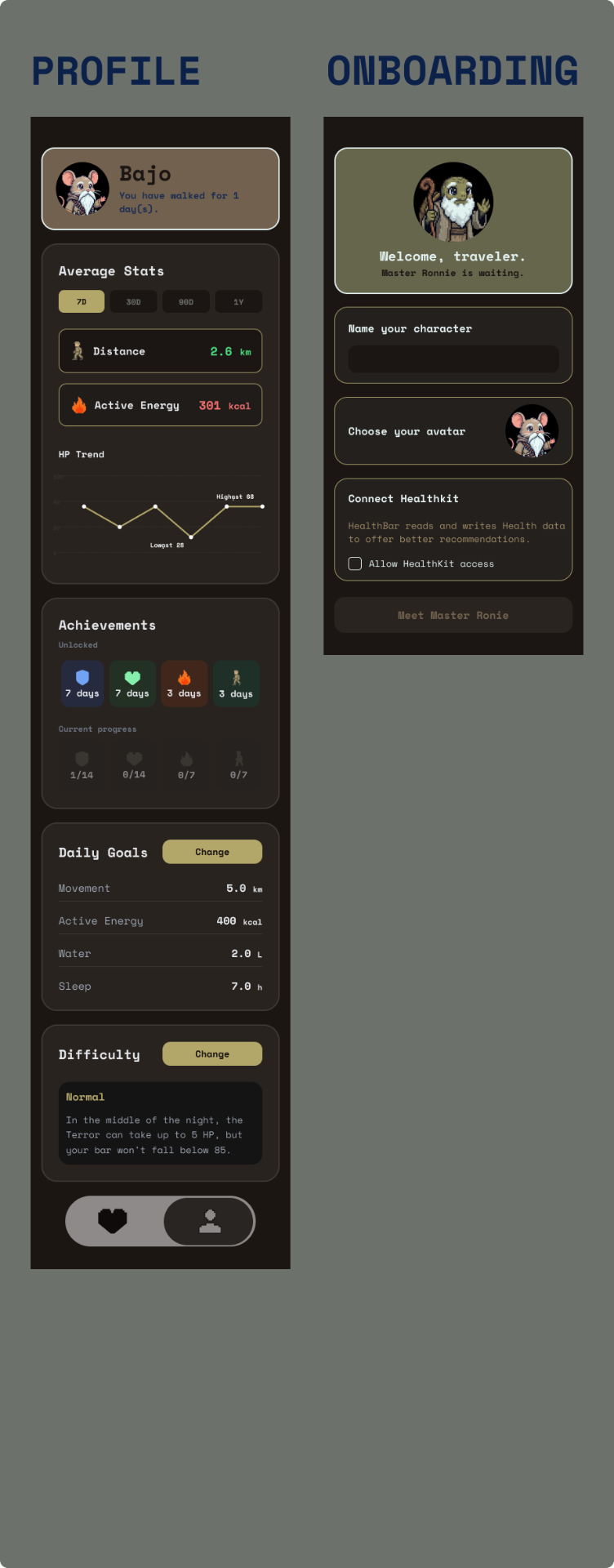
First launch introduces the world, not a form. Character name, pixel avatar, and daily goals are set before HealthKit and notification permissions are requested — the ask comes after the value, not before it.
- —Character creation (name + avatar)
- —Daily goal configuration (steps, energy, water, sleep)
- —HealthKit + tracking permission
- —Non-medical disclaimer
The dashboard as home base.
Once inside, the app becomes a single daily loop: check HP, get one suggestion, log an action, see it reflected in the combat log.
- —HP hero card with live status
- —Mood check-in (low / neutral / great)
- —Mentor guidance (one action, one button)
- —Combat log + Ronnie Feed
Long-term progress.
- —Average stats across 7D / 30D / 90D / 1Y
- —HP trend
- —Achievements (hydration, rest, mood, activity streaks)
- —Daily goals & difficulty settings
Deeper reads for Pro.
- —Stress load, recovery score, body age estimation
- —Personal pattern correlations
- —Ad-free, deeper insight charts
Bringing it to life
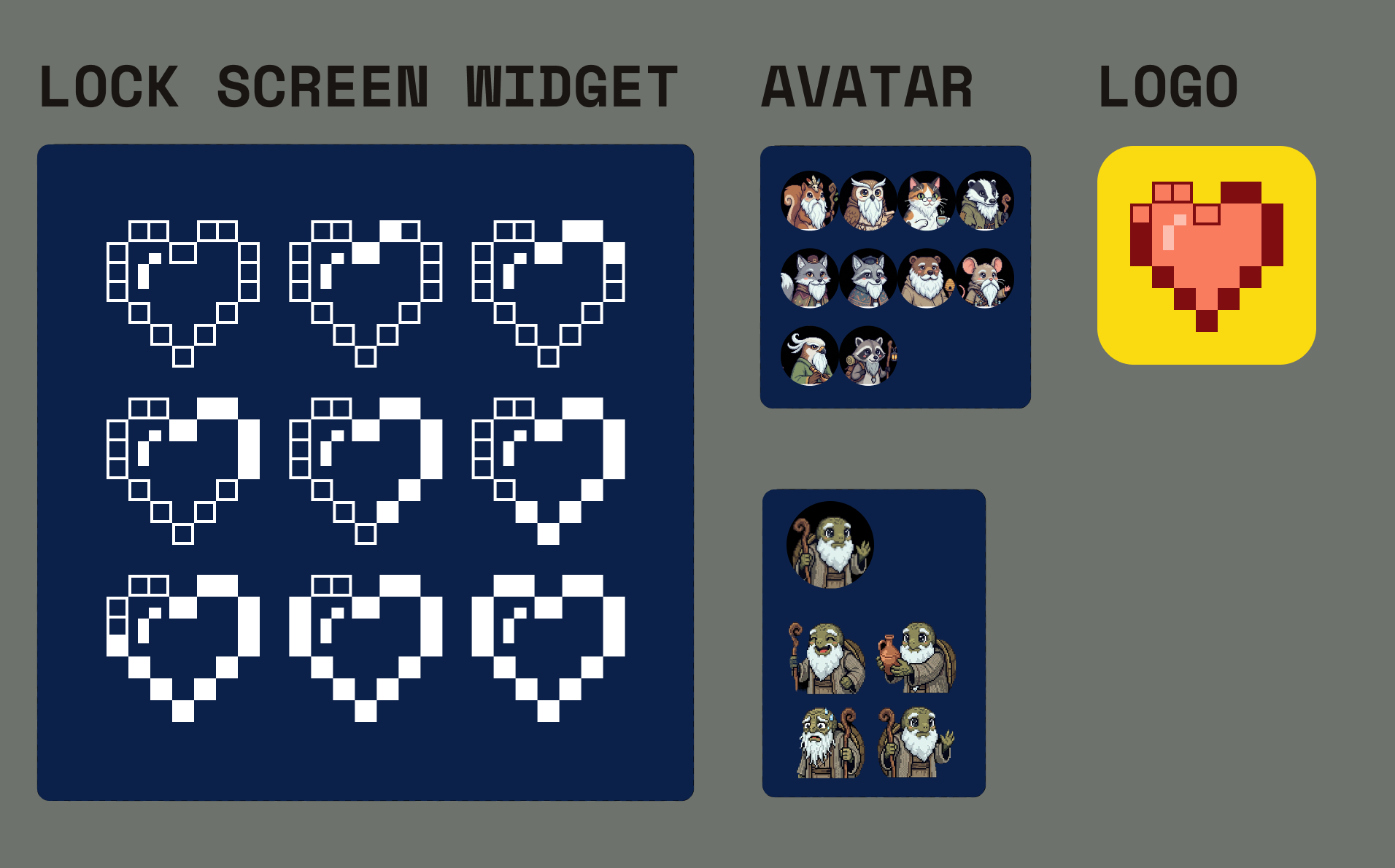
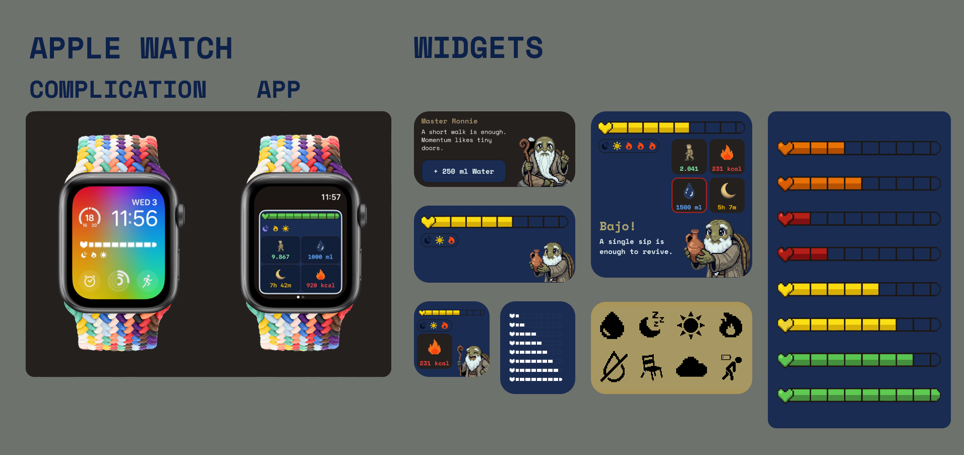
Design System
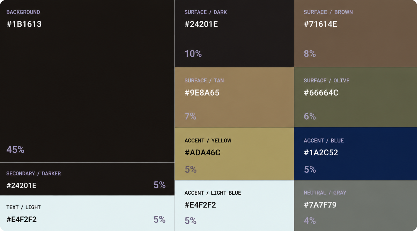
A pixel-RPG palette built for a dark, low-glare surface: a near-black base (#1B1613, 45%) carries brown, tan, and olive surface tones for cards and containers, with a warm yellow accent (#ADA46C) reserved for HP, and a navy / light-blue pair (#1A2C52, #E4F2F2) for night and water states — so the eye always knows which color means what.
Typography runs on Space Mono throughout — its fixed-width, terminal feel reinforces the "game log" tone of the app, from the HP counter down to the smallest combat-log timestamp.
Structure first
Rather than a separate low-fidelity pass, HealthBar's structure was built straight into Google Stitch: a custom styleset — color tokens, Space Mono type scale, and the pixel-heart component — was set up first, so every generated screen already spoke the same visual language from the first draft onward.